Saturday, April 30, 2011

Early Espresso

Early Espresso is a new color that debuted this July. I LOVE this brown hue, and it has gotten quite a workout in my stamp room.

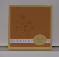
The "Dynamic Duo" colors are Early Espresso and Soft Suede. Both 3x3 cards feature the large floral image from the Fabulous Florets stamp set, which is on p22 of the Summer Mini Catalog. The sentiment which reads 'the earth laughs in flowers' is also from that stamp set. I stamped the '{thanks}' sentiment (from the Pretty Postage stamp set) in Early Espresso ink onto Confetti White card stock and tore around the edges. The layer of Early Espresso card stock behind the sentiment is punched with the new Postage Stamp punch.


I think my photography skills, which are minimal at best, went AWOL on this card. I promise it looks better in real life. The "Creative Combination" colors are Early Espresso, Marina Mist, and Tangerine Tango; I added Confetti White card stock to balance this bold combination. The Marina Mist layer is dry embossed using the Square Lattice embossing folder and the Big Shot. The Early Espresso layer is spritzed with my mixture of rubbing alcohol and Frost White Shimmer Paint. All of the punched pieces were punched using the AMAZING Blossom Bouquet Triple Layer punch. I used a Whisper White Jumbo Brad and some gorgeous Basic Rhinestones to top it all off.


♥♥♥♥♥LOVE how this scrapbook page turned out!!! I used My Digital Studio to create this page in the "Getting Started Combination" colors: Early Espresso, Whisper White, and Pretty in Pink. I am so excited to be able to create some 'pink' scrapbook pages now!! I have two boys, so lots of 'blue' pages. Could my Mom (who is also my Upline ☺) look any happier??!!

Pin It!

Friday, April 29, 2011

Chocolate Chip

What's not to love about Chocolate Chip??? It's such a great color, and it has 'chocolate' in its name!

This simple 3x3 card uses the "Dynamic Duo" colors: Chocolate Chip and Crumb Cake... yum! ;)
I stamped 'thank you' (from the Teeny Tiny Wishes stamp set) in VersaMark ink, and heat embossed using clear embossing powder. 'What's that awesome punched piece??!!' you ask??? Well, it's two punched pieces actually... from the Doily Triple Layer punch (122465 $23.95). This punch is in the Summer Mini Catalog, which starts May 1st. I have to tell you, that one of the best perks of being a demonstrator is not having to wait to order awesome goodies. :)


The "Creative Combination" colors are Chocolate Chip, Wild Wasabi, and Pretty in Pink. I used the Apple Blossoms Hostess stamp set on this card. The sentiment is punched out with the 2"x1-3/8" Oval punch. Then I punched a piece of Pretty in Pink card stock with the Modern Label punch and cut that piece in half to layer behind the oval.


I really like how this card turned out using the "Sweet Set" colors: Chocolate Chip, Tangerine Tango, and Always Artichoke. I used the Extreme Elements stamp set to create the background images. The Extreme Skateboard image is stamped in VersaMark ink and heat embossed with clear embossing powder. I used a Chocolate Chip marker to ink 'happy' (from Teeny Tiny Wishes), stamped, cleaned, and then used the marker to ink 'birthday'. The sentiment is then punched out with the 1" Circle punch, and tied on with Hemp Twine. To finish off the card, I gave it one more layer of color with a Chocolate Chip marker and the Color Spritzer Tool.

Pin It!

Thursday, April 28, 2011

Pink Pirouette

Pink Pirouette was previously an 'In Color, ' and it made a return this July. It is now a Core Color in the Subtles Collection.

The "Creative Combination" colors are Pink Pirouette, Baja Breeze, and Early Espresso. The images on this card are from the Fast & Fabulous Hostess stamp set, which is a great set for the Two-Step Stampin'® technique. The sentiment is from the Thoughts & Prayers stamp set. I used two punches on this card: Eyelet Border and 2-1/2" Circle.


The "Sweet Set" colors are Pink Pirouette, Sahara Sand, and Always Artichoke... a perfect color combination to make this card for my brand new niece born this evening!!!! For some reason, this photo just doesn't do the card justice - my projects always look better in real life, especially this one. I stamped the image from the Four Frames stamp set and punched it out with the Decorative Label punch. Using my Blender Pen, I added a hint of color (Pink Pirouette) to the flower petals. I punched a piece of Pink Pirouette card stock using the Curly Label punch, and then cut it in half to layer behind the 'frame' image. Two Basic Pearls and a Seam Binding bow add the finishing touch. I can't wait to give it to her... well, to my sister-in-law... as I get to meet her for the 1st time tomorrow! Yay!! :)

Pin It!

Monday, April 25, 2011

Pretty in Pink

Today's card - Pretty in Pink - is from the Subtles Collection.


The "Dynamic Duo" colors are Pretty in Pink and Melon Mambo. Since it doesn't get any more 'girlie' than this, I thought... why not throw in some glitter? For this card I used the Birthday Bakery Hostess stamp set, and the Homemade stamp for a little detail on the card stock punched with the 2-3/8" Scallop Circle punch. All of the images are stamped in Melon Mambo ink, so I used Pretty in Pink and Melon Mambo markers to add a bit of color. The grosgrain ribbon and Dazzling Diamonds glitter just make it the perfect girlie birthday card :)


The "Creative Combination" colors are Pretty in Pink , Certainly Celery, and Bashful Blue. I guess I wanted to give the Homemade stamp a workout - it really does add a great little detail to card stock you want to punch with the 2-3/8" Scallop Circle punch. The cute little whale from Fox & Friends is stamped in Bashful Blue ink and punched out with the 1-3/4" Circle punch.


I love our collection of Build-A-Bear Workshop stamps and Big Shot dies. They are easy to use to make the cutest projects. I stamped the little bear three times - twice onto Whisper White card stock and once onto the DSP. I used my Snips to cut out the dress, which I attached after coloring the bear with markers and Watercolor Pencils. I used my Snips again to cut out only the dress collar from the remaining stamped image. Then, I added a tiny bit of Crystal Effects to her shoes and flower. While this will be a one-of-a-kind card, I will definitely use the "Getting Started Combination" colors again (Pretty in Pink, Marina Mist, and Daffodil Delight).

Pin It!

Saturday, April 23, 2011

Blushing Bride

Today's card from the Color Coach is Blushing Bride, which is from the 'In Color' collection. Blushing Bride will be available until June 2012.


Sometimes, you need a simple and easy design - this card is exactly that. The "Dynamic Duo" colors are Blushing Bride and Regal Rose. I stamped the image (twice) from the Just Believe stamp set in Blushing Bride ink. The sentiment from the Something to Celebrate Hostess stamp set is stamped in Regal Rose ink. 1/2" Stitched-Poly ribbon in Blushing Bride is the perfect finishing touch.


The "Creative Combination" colors are Blushing Bride, Early Espresso, and Pear Pizzazz. LOVE, LOVE, LOVE these colors together!! The image and sentiment are from the Easter Blossoms stamp set. I love SU's punches - the more the merrier! This card features the Decorative Label, Scallop Oval, and 1-3/4"x7/8" Oval punches. I have become very addicted to the Basic Pearls... don't you just love them, too??? They're so easy to use with the adhesive already on the back... my projects just beg for them ;) It's difficult to see in the photo, but there is a yummy layer of shimmer on the card. I mixed some rubbing alcohol and Frost White Shimmer Paint in a travel-sized spray bottle. It works beautifully!!


Do ever finish your project, and feel like you can't wait to share it with someone? I feel that way all the time. I really felt it after I was done with this card... I wasn't quite sure what I was going to do with the "Sweet Set" colors: Blushing Bride, Perfect Plum, and Sahara Sand. I never would have put these together on my own... which would be sad to miss such a pretty combination. Thank you Color Coach :) I used the Vintage Vogue stamp set, Blushing Bride and Perfect Plum ink, 1/2" Stitched-Poly ribbon, and a little clip from the Clips Assortment (112580 $6.95) to create this card. So pretty :)

Pin It!

Friday, April 22, 2011

Regal Rose

The "Creative Combination" colors are Regal Rose, Early Espresso, and Daffodil Delight. I dry embossed the Regal Rose card stock using the Vintage Wallpaper Embossing Folder and the Big Shot. I stamped the image from the Four Frames stamp set in Early Espresso ink, and punched it out with the Decorative Label punch. I also punched a label from Early Espresso card stock, cut in in half lengthwise, and layered it behind the top and bottom of the punched image.The sentiment is stamped in Regal Rose ink from the Fabulous Phrases stamp set. If tying ribbon is a challenge for you, try the 5/8" satin ribbon - it's very easy to work with :)


The "Sweet Set" colors are Regal Rose, Tempting Turquoise, and Sahara Sand. The focal point on this card uses the technique called two-step stampin'. Awash with Flowers is a great stamp set to use if you would like to try 'doing the two-step' at home ;) I used Sahara Sand for both the solid and outline images that create the leaf - I just stamped off onto scratch paper before stamping the solid image. The Tempting Turquoise strip of card stock is punched using the Dotted Scallop Ribbon border punch, and tucked behind Sahara Sand card stock which is dry embossed with the Square Lattice Embossing Folder and the Big Shot. The turquoise rhinestone brad is the largest size from the Circle Ice assortment (109111 $10.95).

Pin It!

Thursday, April 21, 2011

Happy Birthday to me!!

Yep, it's my birthday today! I turned 29... again! (teehee) It's great to turn 29 every year :)
I spent the day with my family, so the card I'm sharing tonight is not one I made. Stampin' Up! announced this January that they would be sending demonstrators birthday cards made using My Digital Studio. Happiness :)

This card is super cute! And I love how they added the rhinestone dotting the "i" - it's just the right amount of bling :)

Did you know you can design the inside of cards with My Digital Studio? Cute!! Hmmm... now you're thinking about signing up to be a demonstrator so you can get a cute birthday card from Stampin' Up! - with a message inside for an extra discount - right??? ;)

Pin It!

Wednesday, April 20, 2011

Dynamic... Trio???

Today's card from the Color Coach is Regal Rose. Sadly, I didn't really get to spend time in my stamp room today :( Just too many things to get done... not enough hours in the day.
Anywho, when I was playing around with the "Dynamic Duo" colors - Regal Rose and Rose Red - I wanted to make an anniversary card. It was looking... ok... but, I needed to soften it a little. So I ended up with a layer of Pink Pirouette on my card. So, I guess I made up a beautiful 'Dynamic Trio' :)
The layer of Pink Pirouette is dry embossed with the Vintage Wallpaper Embossing Folder on the Big Shot. I then lightly sponged over the raised images with Rose Red ink.
After cutting the Rose Red card stock on the Big Shot with the Fun Flowers Bigz L die, I spritzed the flower layers with water, then crumpled and distressed them. When they were dry, I sponged the edges with Rose Red ink. The layers are held together with a Filigree Designer Brad.
I stamped an image from the Four Frames stamp set onto Regal Rose card stock and punched it out with the coordinating Decorative Label punch. The 'forever' sentiment is from the Fabulous Phrases stamp set.
A piece of gathered Rose Red Seam Binding pulls the card together. Then, to make it super fabulous, I spritzed the card with my mixture of rubbing alcohol and Frost White Shimmer Paint. Love it! :)

Pin It!

Melon Mambo

Melon Mambo is a great pink that was a previous 'In Color'. It worked it's way into the core colors during the color renovation, and plays happily with the other hues in the Brights Collection :)
The "Dynamic Duo" colors are Melon Mambo and Pink Pirouette. I really like these 2 pinks together :) The card base is dry embossed using the Elegant Bouquet Embossing Folder and the Big Shot. I also used the Big Shot to die cut the Scallop Square. I used markers to ink the cake image from the Tag Alongs stamp set. The heart on top of the cake and the center of each dry embossed flower have a sprinkling of Dazzling Diamonds Glitter :) You can currently find the Pink Pirouette 1-1/4" grosgrain ribbon in the Clearance Rack for a great bargain.


This scrapbook page uses the colors in the "Creative Combination": Melon Mambo, Daffodil Delight, and Tempting Turquoise. I created this page on Stampin' Up!'s amazing software... My Digital Studio. It was super easy to create. If you have purchased My Digital Studio, and would like to know more about using it, I am teaching a class on May 22nd.
Click here to see a card and bookmark using the "Creative Combination."

This 3x3 card uses the "Sweet Set" colors: Melon Mambo, Old Olive, and Elegant Eggplant. Circle punches and the Scallop border punch made this card very easy and quick to put together. The Just Believe stamp set and 1/8" Taffeta ribbon get frequent use in my stamp room :)

Pin It!

Monday, April 18, 2011

Riding Hood Red

Today's color, Riding Hood Red, is a previous 'In Color' that made a return when SU did the color renovation in July. It's a neat hue to play with :)

If you can't tell, I LOVE Stampin' Up!'s color palette. It's what drew me in. After years of shopping from store to store searching for accessories, card stock, and papers to match, my mother introduced me to Stampin' Up!. Fast forward a few years, and she is now a demonstrator... and also my upline :) Anywho... I love having coordinated products shipped right to my door. It saves me time and money... and the headache of shopping with two boys!
This card is a perfect example of Stampin' Up!'s amazing color palette, and how great their coordinating products are. The "Dynamic Duo" colors are Riding Hood Red and Cherry Cobbler. Red is the most difficult hue to coordinate if you're shopping all over town. This card alone shows how the Cherry Cobbler ink, Seam Binding, button, and card stock match each other perfectly.

The "Creative Combination" colors are Riding Hood Red, Baja Breeze, and So Saffron. I used the With All My Heart stamp set, and the Fancy Flower and Designer Label punches. The Styled Vanilla frame is from the Hodgepodge Hardware kit.

Here's a little treat for all the digital crafters! I made this card using Stampin' Up!'s My Digital Studio. This is amazing software!!! I play around with it almost every day. It's very easy to use, even if you are 'technology challenged' like me. I literally made this card in under 5 minutes. How??? Rather than starting from scratch, I chose a pre-designed card. Then, I changed the background and colors of some of the other elements to the "Sweet Set" combination: Riding Hood Red, Basic Gray, and More Mustard. If you ever have any questions about My Digital Studio, or would like to see it in action, just ask :)

Pin It!

Vintage Love

I decided to add 1 more post for tonight ;)
This card is from my (February) Technique Tuesday class. I chose to add it tonight, because I actually started with Bravo Burgundy when I was choosing colors.

I ended up using 3 stamp sets (Broadsheet Alphabet, Friends Never Fade, and Ornate Blossom) and 4 colors (Bravo Burgundy, Old Olive, Soft Suede, and Concord Crush) on this card. The Bravo Burgundy layer is stamped in Bravo Burgundy ink, and then dry embossed using the Finial Press Embossing Folder and the Big Shot.
One noticeable element of the 'vintage' style, is that there are a lot of layers. In addition to the card stock, there is a layer of Newsprint DSP, as well as two punched pieces - Decorative Label and 2-1/2" Circle. A scrap of Crochet Trim pinned to the card stock with a Vintage Trinket fits in perfectly with any 'vintage' style project.

Pin It!

Sunday, April 17, 2011

Bravo Burgundy

Well, if you were to ask me to choose 1 SU color I could live without... it would be Bravo Burgundy. It's nothing against SU... I've just never been a fan of burgundy. It might have something to do with an old '79 Malibu station wagon in that color... but that's another story for another day ;)
Anywho... I challenged myself to use this color on both a masculine and feminine card. I'm really pleased with my results :)

The "Sweet Set" colors are Bravo Burgundy, More Mustard, and Crumb Cake. Since this is a masculine card, I wanted a lot of texture. The layer of Bravo Burgundy is crumpled and distressed, then I applied ink directly from the ink pad to the card stock. The layer of Crumb Cake is dry embossed using the Square Lattice Embossing Folder and the Big Shot. Can you guess where the square background on the Very Vanilla card stock came from? I inked my clear block (size D) in Crumb Cake ink and 'stamped' it onto the card stock! No uni-taskers in my stamp room ;)
The images are all from the Autumn Days stamp set. Like how the hemp twine takes the place of ribbon? I even added texture to the hemp twine by tying knots along the length.
*Note: if you are going to try the knotted twine at home, it takes more than you think. I used a piece of twine that was double the width of the Crumb Cake card stock.


You might have noticed there was no post yesterday. That's because I will admit I was really struggling with the "Creative Combination" colors: Bravo Burgundy, River Rock, and Baja Breeze. I started playing with this color combo on Thursday, but it wasn't until Saturday night that I found my burgundy mojo. But once I found my stampin' groove, I was a happy girl. In the end, I actually love how this card turned out :)
I used the Clearly for You stamp set, which I got for FREE at Leadership :) The square with the birds was inspired by one of our Leadership Conference 'make & takes'.
Each section is a 1-1/8" square. I used a layer of Bravo Burgundy card stock (4" x 5-1/4") and squares of River Rock, Baja Breeze, and Very Vanilla card stock, as well as squares of First Edition DSP (121878 $11.95).
The birds are stamped in StazOn ink, traced with a River Rock marker, and painted with Champagne Mist Shimmer Paint (116806 $5.95) and an AquaPainter. The crown image was first stamped in River Rock ink. Then I 'inked' the crown stamp with the Shimmer Paint and a Sponge Dauber, and stamped on top of the previously stamped image. Baja Breeze Seam Binding and two sizes of the Basic Pearls (119247 $4.95) add the perfect feminine touch.

Pin It!

Friday, April 15, 2011

Cherry Cobbler

When I saw Cherry Cobbler the first time, it was love at first sight. It was the shade of red I'd been waiting for! It is the perfect shade of red for your projects with a 'vintage feel' - especially Christmas and Valentine projects.


The "Dynamic Duo" colors on this 3x3 card are Cherry Cobbler and Riding Hood Red. To get the varied color on the flower, I used the 'rock & roll' technique. First, I inked the stamp in Riding Hood Red. Then I stamped off onto scratch paper, and rolled the edges (with the stamp at a slight angle) in the Riding Hood Red ink. Finally, I rolled the edges (with the stamp at a steep angle) in Cherry Cobbler ink. When using the 'rock & roll' technique, it is important to remember to ink your stamp with the lightest color first. The flower image is from Petal Pizzazz, and the sentiment is from the Silhouette Sentiments Hostess stamp set.


The "Creative Combination" colors are Cherry Cobbler, Daffodil Delight, and Early Espresso - which are all new colors introduced in July. The images are from the Eastern Blooms stamp set... one of the sets I got in my Convention bag a few years ago. I used Cherry Cobbler and Early Espresso markers to ink the branch image. The sentiment is from the Thank You Kindly stamp set. I love the look of these three punches layered together: Decorative Label, Scallop Oval, and 1-3/4"x7/8" Oval.
Click here to see another card using these "Creative Combination" colors.


The "Sweet Set" colors are Cherry Cobbler, Pumpkin Pie, and Night of Navy. I used markers to ink the Ornate Blossom stamp. I like how the Pumpkin Pie card stock punched from the Dotted Scallop Ribbon border punch peeks out along the bottom of the focal point. The sentiment is from the Curly Cute stamp set.

Pin It!

Thursday, April 14, 2011

Real Red

I use a lot of Real Red... not just at Christmas or Valentine's Day. It's kind of a "go to" color for me when I am scrapbooking my boys' pictures.


The "Creative Combination" colors are Real Red, Bashful Blue, and Crumb Cake - a great combination. This card made its 1st appearance on my blog back in July, so is it cheating to show you one of my favorites again??? (After yesterday's workout on this blog, I needed a little break.) I adore the Sock Monkey stamp set (and both of his accessory stamp sets, too)!


The "Getting Started Combination" colors are Real Red, Early Espresso, and Pumpkin Pie. I am probably going to wear out the Dotted Scallop Ribbon border punch - it just makes everything so cute! The image is from the Funky Four stamp set, which I inked using markers. The sentiment is from the Fabulous Phrases stamp set. I have both sets in 'clear-mount' which made it very handy for me to place both words on a block, then ink and stamp them together :)

Pin It!

Wednesday, April 13, 2011

Poppy Parade

Poppy Parade is an "In Color" that will be available until June 2012. When SU! launched the color renovation this July, it was announced that starting this year, "In Color" collections will be available for two years. In July 2011, we will be introduced to 5 more "In Color" choices, that will have their own 2-year term.


When you are playing with color choices in your own stamping room, try to image the color wheel (or find one on the internet or at your local craft store in the painting section). Sometimes I use the Color Coach and a color wheel together to choose pleasing combinations. For example, a classic color combination that always works is a triad using the primary colors: red, yellow, and blue. This Easter card - if you think of the colors on a very basic level - uses that primary triad combination. Of course (on a more sophisticated level) the "red" on this card is a red-orange with red added, the "yellow" on this card is a tint, and the "blue" on this card is a tint of blue-green. Sometimes thinking of all the hues available (and their tints, tones, and shades) can be overwhelming, but if you think of them in basic terms, you might find that choosing great colors to work with isn't so hard after all. Thank goodness Stampin' Up! has taken a lot of the guesswork out of choosing colors by creating the Color Coach. My point in all this rambling??? I just wanted you to know there is a "science" behind the combinations on the back of each card in your Color Coach.
We made this cute card in my Spring/ Easter card class (in March) using the "Creative Combination" colors: Poppy Parade, Baja Breeze, and So Saffron. The image and text are from A Good Egg stamp set.


I really enjoyed making this card. It is different from my usual style, and it felt good to 'step out of the box.' I used the "Sweet set" colors: Poppy Parade, Sahara Sand, and Not Quite Navy. I don't think I would have chosen this combo without the Color Coach suggesting it. I'm glad I tried it :) This layout comes from the March issue of Stampin' Success - a magazine for demonstrators from Stampin' Up!. Each month, there is a card template (or two) featured. At my team meetings, we all bring a 'show & tell' using the template as a guide. This was one of my 'show & tell' items from my April team meeting. I used the Oval All, Perfect Punches, and Tiny Tags stamp sets, along with the 1-3/4"x7/8" Oval, Scallop Oval, and Jewelry Tag punches.


I saved the best for last ;)
Yesterday, I was quite stressed about using the "Dynamic Duo" colors: Poppy Parade and Tangerine Tango. While I appreciate orange hues, they are more difficult for me to be creative with, and this is my third post using Tangerine Tango as 1 of the "Dynamic Duo" colors. So.... I walked away. I started working on my card again this morning, and went a whole new direction. I LOVE, LOVE, LOVE how this card turned out!!!! I will absolutely be using this card in an upcoming class... or two ;) The Build a Blossom stamp set is perfect for the two-step stampin' technique. The petals are stamped using only Poppy Parade ink. This card is even prettier in person - it's difficult to capture the beauty of the Shimmery White card stock in a photo. The teeny little sentiment is stamped from the Tiny Tags stamp set and punched out with the Jewelry Tag punch. The Poppy Parade Glimmer Brad in the center of the flower is also more loved when seen in real life :)

Pin It!

Tuesday, April 12, 2011

Cajun Craze

Back in July, when SU announced the color renovation, I was worried that I might miss Really Rust as it was "replaced" by Cajun Craze. Once I saw Cajun Craze in real life... Rust who? Cajun Craze is such a beautiful color! It has a little less orange, and a bit more brown than Really Rust, and works well with so many colors.

The "Dynamic Duo" colors are Cajun Craze and Tangerine Tango. I'm not loving this card... I will admit I found this "Dynamic Duo" a challenge for me. I used the Just Believe stamp set and the Finial Press Embossing Folder on this card.


I made this pretty card back in the fall for a monthly SU contest. I didn't win... but I still love this card and feel happy that I made something "submission worthy." The "Creative Combination" colors are Cajun Craze, Old Olive, and Baja Breeze. I used the Very Vintage jumbo wheel for the background on both the Baja Breeze and Cajun Craze card stock. The sentiment is from the Occasional Quotes Hostess stamp set. The Chantilly Crochet Trim and Antique Brad are the perfect finishing touches.


This was one of the stamping projects I prepared for my Team meeting tonight :) I love coming up with new project ideas to share with my team!
This card features the "Sweet Set" colors: Cajun Craze, Perfect Plum, and Always Artickoke. The stamped flower petals are from the Build a Blossom stamp set, and punched out with the coordinating Blossom Petals punch. We used the Two-step Stampin' technique to create the petals with only Cajun Craze ink. (I will be teaching more on Two-step Stampin' at my Technique Tuesday class April 26th.) The punched petals are layered onto Cajun Craze card stock die cut from the Fun Flowers Bigz L Die. If you don't already have the Framed Tulips Embossing Folder, put it at the top of your wishlist! It's just so pretty :) The sentiment is stamped in Perfect Plum ink from the Afterthoughts Hostess stamp set.

Pin It!

Tangerine Tango

Tangerine Tango is another hue that was a previous "In Color". It made a return this July during the color renovation, and lives happily in the Brights Collection.

The Color Coach lists the "Dynamic Duo" as Tangerine Tango and Cajun Craze. I used the Circle Circus stamp set to create the background and the focal point. The sentiment is from the Family Phrases stamp set.


Wow! The "Creative Combination" colors are bright! - Tangerine Tango, Tempting Turquoise, and Old Olive. I had fun making this card :) The heart image is from the I {Heart} Hearts stamp set. After snipping the image, it layers nicely on a card stock heart punched using the Full Heart punch. The frame is made with a 3x3 square of card stock which has been punched in the center of each side using the Pinking Hearts Border punch. I LOVE how the background turned out. I made it by inking the Heart Pressed Letterpress Plate with Whisper White Craft ink, setting the Tempting Turquoise card stock on the plate, and then rolled it through my Big Shot. I know you're wondering where I got this fabulous ribbon, right? You can order the Tangerine Tango 5/8" Striped grosgrain ribbon (111371) from my online store in the Clearance Rack for only $3.49!!


The "Sweet Set" colors are Tangerine Tango, So Saffron, and Pacific Point. I used the Flight of the Butterfly stamp set for this card. And the pretty piece of So Saffron ribbon? Clearance Rack! You can get this as part of the ribbon bundle (114618) for only $3.49! Hmmm... time for some online shopping in your jammies?? ;)

Pin It!

Saturday, April 9, 2011

Peach Parfait

When this color was introduced as 1 of the new "In Colors"... well, I was a little less than thrilled. I've never been a big fan of orange, and I already had Pumpkin Pie. Then I started using Peach Parfait in my projects... wow! How my feelings have changed. I kinda feel like asking SU if Peach Parfait could stay on down the road as a core color. Personally, I think it would play nicely with the other colors in the Subtles Collection. But, I'm not the boss, so I will enjoy using Peach Parfait until June 2012.


The Color Coach lists the "Dynamic Duo" as Peach Parfait and Cajun Craze. The Peach Parfait Designer Series Paper is from the Sale-a-Bration DSP and Accents package. Both sentiments are stamped in Cajun Craze ink from the Thank You Kindly stamp set. I used three Punches to create the flower layers: Fancy Flower, 5-Petal Flower, and the circle punch from the Itty Bitty Shapes Punch Pack. I used the Dotted Scallop Ribbon Border punch on a strip of Cajun Craze card stock. Since I couldn't decide which card layout I liked better, I made both. Which orientation do you like better?


This is a card from my Spring/ Easter card class held in March. We used the Sale-a-Bration DSP and a stamp from the Sale-a-Bration set Punch Bunch. Peach Parfait, Pear Pizzazz, and Not Quite Navy - the "Creative Combination" - markers were used to ink the stamp.


The "Sweet Set" colors are Peach Parfait, Baja Breeze, and Riding Hood Red. I used those colors of markers to ink this image from the Cute by the Inch Hostess stamp set. The DSP on the bottom of this card is also a Hostess choice :)
Now, you are surely wondering where I got that super cute shape cut from Riding Hood Red card stock, that layers nicely behind the Scallop Square???... from my scrap drawer, of course ;)
This neat shape was leftover from a treat pouch I made using one of the Holiday Windows (116821 $29.95 - set of 4) and the Movers and Shapers Bigz XL Die (114506 $42.95). This shape is the "window" that was cut out. And you can't toss something that cute out... I knew that "someday" it would come in handy! :)

Pin It!

Friday, April 8, 2011

Pumpkin Pie

Pumpkin Pie has always been an easy color for me to use... then I met my match with the Color Coach. For some reason, I struggled with the combinations suggested on the Coach. It took me a while, but in the end, I created two cute cards that I was really happy with. Once again, the Color Coach is winking at me saying, "see, I told you those colors would go together!"


When I sat down to work on a card using the "Creative Combination" colors, I was really stumped. I pulled out a ton of products... stamps, ribbons, buttons, etc. Nothing was working for me. So I looked around my stamp room hoping for inspiration. My eyes settled on a card my 7yr-old made for me a few weeks ago:
So the card my son made, became my inspiration for this card:
I really like how it turned out :) The "Creative Combination" colors are Pumpkin Pie, Pacific Point, and Real Red. The images are from the Choo Choo stamp set and the Right on Track wheel; the sentiment is from the Family Phrases stamp set.


The "Getting Started Combination" colors (Pumpkin Pie, Early Espresso, and Daffodil Delight) were a little bit easier for me to work with. I am super happy with this card layout! I will definitely be using this layout in a class I am teaching in June for Carthage College's alumni event. If you don't already have the Create a Cupcake stamp set (wood 121915 $22.95 or clear 121982 $16.95) and the coordinating Build a Cupcake punch (121807 $16.95)... well, you need to get them! They are on p22 of the Occasions Mini Catalog, which ends April 30th.

Pin It!

Thursday, April 7, 2011

More Mustard

I have a tendency to mainly use More Mustard in the Fall. So, it was good to challenge myself to use this color for other times of the year. My Woodgrain background stamp and Silhouette Sentiments Hostess stamp set have not seen enough ink, so I used them on today's cards.


The "Dynamic Duo" colors are More Mustard and So Saffron. The sentiment is punched from the 3/4"x15/16" Oval punch.


The "Creative Combination" colors are More Mustard, Night of Navy, and Cajun Craze. After stamping the background with More Mustard ink, I used the Color Spritzer Tool and the Cajun Craze marker to add another "layer" of ink. The frame embellishment is from the Styled Silver Hodgepodge Hardware.

A bonus project using the "Creative Combination" colors! I made this scrapbook page in the Fall. The title and leaves are stamped from the Harvest Home stamp set. I created the flower images using More Mustard & Cajun Craze ink, a stencil from Elegant Trio (118262 $9.95) and Sponge Daubers.


The "Sweet Set" colors are More Mustard, Old Olive, and Bravo Burgundy. The image is punched using the 2"x1-3/8" Oval punch (119859 $16.95), and matted onto an oval cut from the Ovals Originals Die (114525 $15.95). A scrap of 1-1/4" Striped Grosgrain Ribbon adds the finishing touch.

Pin It!
Related Posts Plugin for WordPress, Blogger...